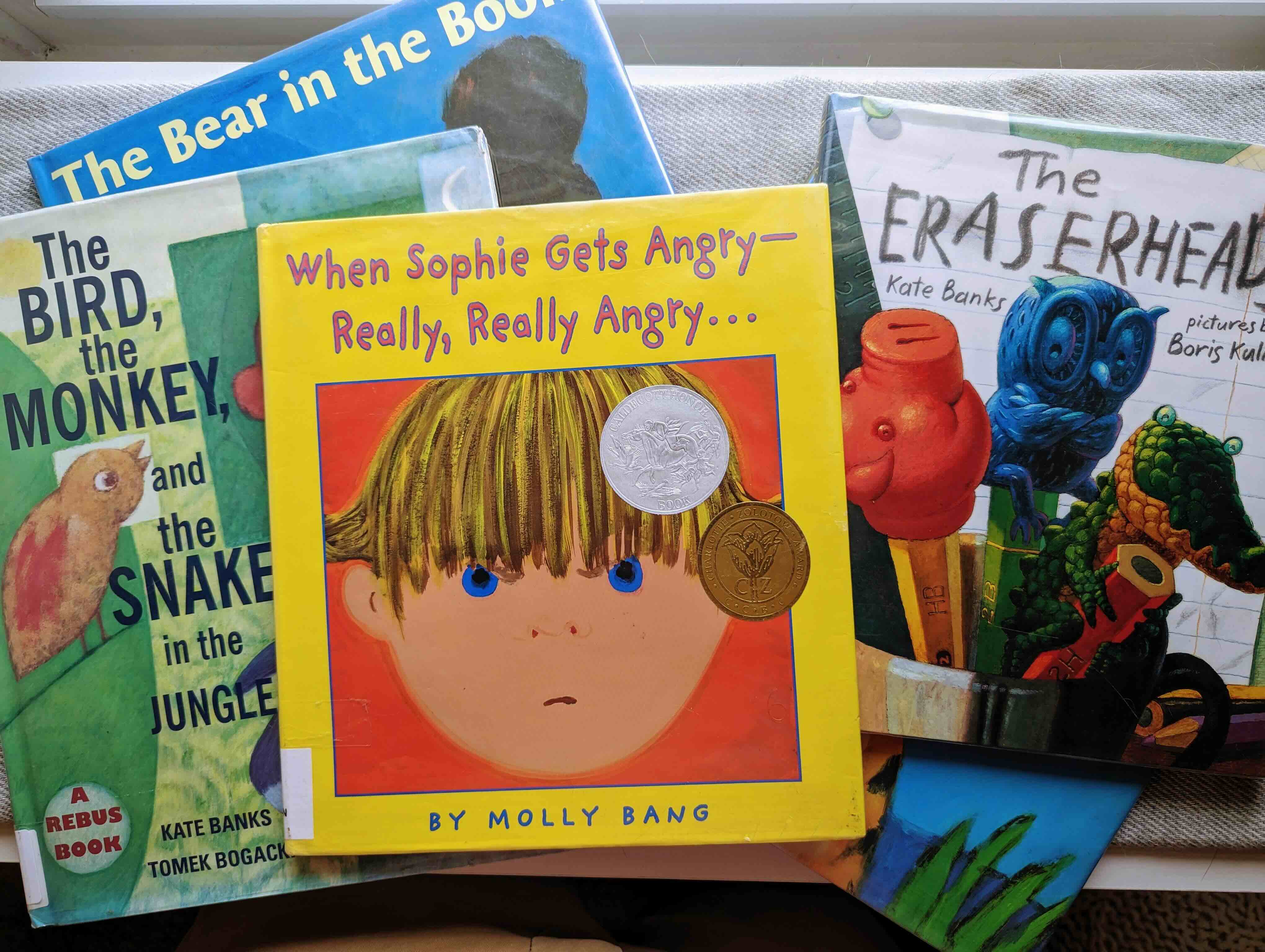
When Sophie Gets Angry-Really, Really Angry…
by Molly Bang
Published 1999. Beautiful artwork with stunning use of colors and lines with second-to-none compositions. The text is a lovely mix of rhyme and rhythm, for example: “She kicks. She screams. She wants to smash the world to smithereens.” The message is excellent as we see the main character feel strong emotions and how to deal with them, with a loving home waiting once the character is finished. Fantastic read.
The Bear in the Book
written by Kate Banks and illustrations by Georg Hallensleben
Published 2012. Very painterly artwork with simplistic colors. The story is unique as it is about reading a book and the experience of ‘bedtime.’ I didn’t pick up on a solid message, but it is a sweet ‘go-to-sleep’ style book.
The Eraserheads
written by Kate Banks and illustrations by Boris Kulikov
Published 2010. Stunning artwork. I love the dynamic and engaging layouts of spreads and the compositions of each illustration. The characters are charming and vibrantly colored. The story is hugely creative, and a few messages can be gathered by the end. Overall, the story feels like you are a part of that type of ‘play’ a child does that is emergent, random, and silly; it is a fun read with a lot to say.
The Bird, the Monkey, and the Snake in the Jungle
written by Kate Banks and illustrations by Tomek Bogacki
Published 1999. I loved the abstract feel of these illustrations and the texture and brush strokes throughout. This book is incredibly unique as it uses symbols and imagery mixed with words to tell its story, which was fun but somewhat exhausting in spots. Still, I was in awe of the layout and how efficiently most spreads could convey their message/text/story. The story is simple, which is good as there is a lot of stuff going on visually, with patterns, symbols, and text dancing across the spreads, but the message is clear and sweet.
Close Your Eyes
written by Kate Banks and illustrations by Georg Hallensleben
Published 2002. I liked the looseness of the drawings and their simplicity paired with the complexity of the marks and strokes of loosely mixed colors and paints. I liked the story until the end and wished it would’ve had more to say or something at all to say about dreams that would’ve fit with the rest of the text.
Thank you,
Caleb


