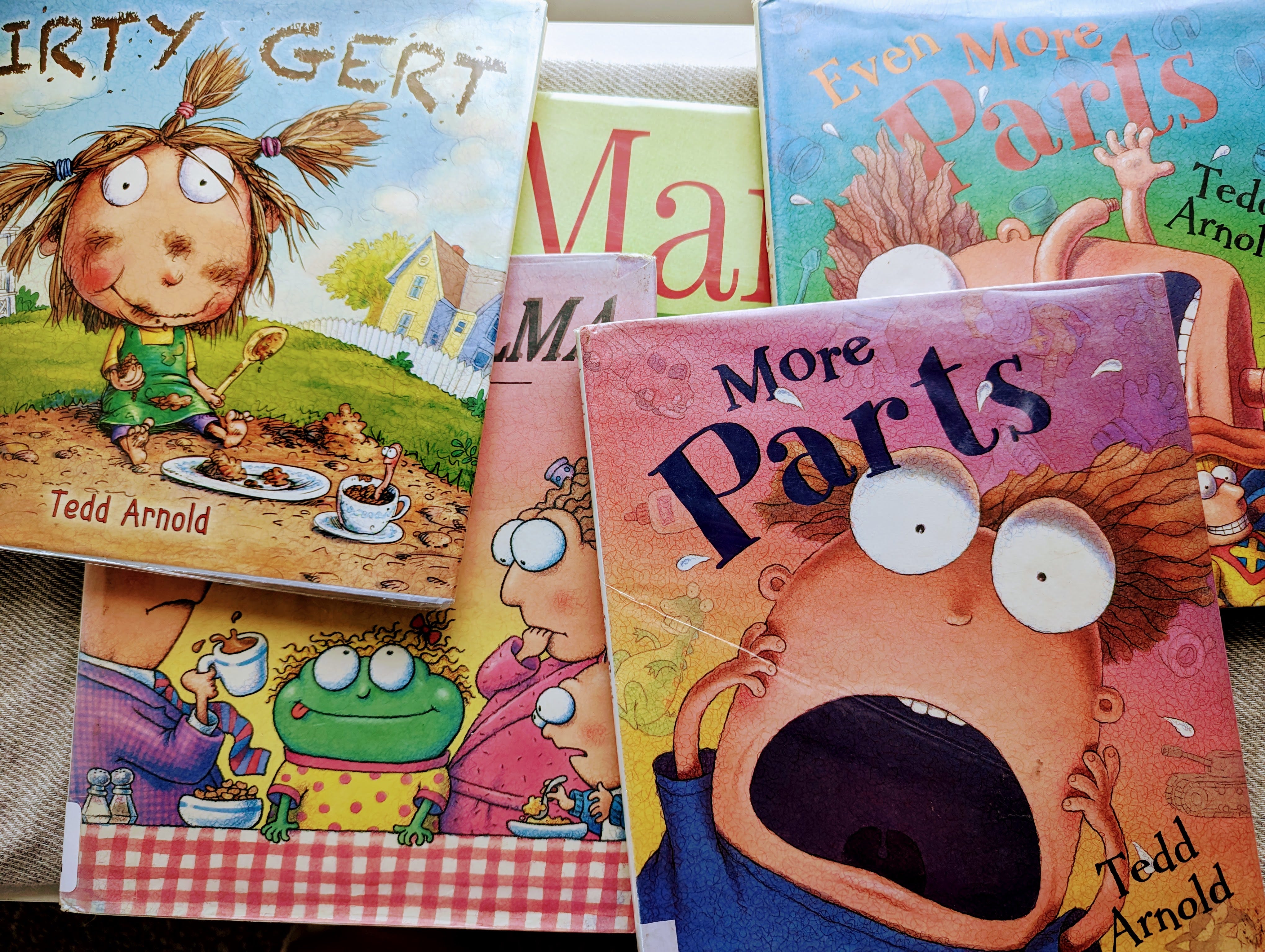
Dirty Gert
by Tedd Arnold
Published 2013. The artwork is so well done, fits perfectly with the text, and is varied. The story is excellent, silly, and incredibly creative. I loved this story because it builds on itself and weaves its message consistently without becoming overwhelming or preachy, and I hope you pick it up.
Green Wilma
by Tedd Arnold
Published 1993. The book starts immediately and wonderfully, and I was engaged from the first page. The story is creative, and the ending is unexpected, with a great message. For all of Tedd Arnold’s books so far, the artwork is extremely well done and full of life and energy. Seeing this artwork makes me feel an instant joy, and I feel like in Ratatouille when the critic is zapped back to childhood.
More Parts
by Tedd Arnold
Published 2001. The story is charming and well told with a great message. I like the build-up and the little twist of an ending. Mr. Arnold, or another designer, has created a unique and impressive design for the text in this book. The wavy and anxious jump of lines and words on the page is well executed and enhances the overall design.
Even More Parts
by Tedd Arnold
Published 2004. An obvious sequel to the previous book, and not as fun this time, but it still is packed with lovely and silly artwork.
Margo Thinks Twice
by Monica Arnoldo
Published 2016. The artwork is fine, but something about it differs from my taste. The story was a bit wordy and could be edited down to better flow. There is a message here, but the meaning and impact are lost by the end.
Thank you,
Caleb


